Background
PLEXOS Cloud is one of the sub-products of Energy exemplar. Its energy modelling and analytics solutions makes it easier to predict future energy markets through sophisticated modelling experience. In short, more forecasting scenarios in less time allows analysts to confidently choose the best outcome.
I worked as a consultant with a team of four and also led the project to tackle various challenges along with the project managers and the co-founder. Get ready for a deep dive!
Duration
8 months (2023)
My Role
UX Designer
Deliverables
Wireframes, concepts & Visual Design
Company Website
It was a 360
degree spin
It was quite overwhelming for me to take up this role on short notice since the UX Designer who worked before me had quit and I was given an opportunity to lead the team.
As a team leader, I was holding different balloons which made the project successful and made sure that none of them flies away.
UX
UI
Etiquettes
Team
management
Delivering
on time
Milestones for each module
Our process for every module was pretty much similar with sprints and Design Reviews happening on every Thursday. We would present our work to the entire panel (around 80 people including product managers and co-founder). This helped me get constructive feedbacks and make refinements in less time to then take it forward for user testing.
Project overview
Initial analysis
Stakeholder collaboration
Concepts & refinements
Design review
Testing & final designs
Generation output
data” module
This module was taken up on a high priority since the analysts faced problems in reading the generation output value for each generator spread across different locations in the map. The product manager shared the exsiting data visualization for the same and after speaking to the analysts, we fleshed out the actual problems which could be solved with a better UX by changing the approach.

Problems with existing designs
Overlapping circles created confusion and it occupied lot of space on the map due to large number of generators
The size and the play with red opacity didn’t cleary communicate the level of output
Unable to compare the value of output at first glance since the output value is missing
Understanding the intent on different zoom levels..
User behavior : Persona - Energy Analyst, ~ 35-60 years old
Zoom out : 0% - 35%
“ I want to get information on areas with max. and min. output levels”
Mid-level zoom in :35% - 75%
“ I want to get information on which area has max or min output levels”
“ I want to know the number of generators producing that generation output”
Zoom in : 75%-100%
“ I want to view the generation output values of each generator”
“ I want to know the type of generator”
“I want to know the name of the generator and its storage value with exact geo-location”
Solution with aggregation logic
After multiple iterations, in order to make it clean and easy, I came up with the idea of aggregating the values of generation output at super zoomed in and mid zoom in levels. This approach was a good shift in logic which could be added across the dashboard for other data visualisations. It was important to create mock-ups with colours and full UI to understand its visibility.
1 . Super zoomed-out (27%) level with aggregated bars depicting the generation output
Red colour was chosen to indicate the output value along with a thin white border to make it visible with other objects on the map e.g - the transmission lines in the background. The width of the bar was designed keeping in mind the character limit of the values to be mentioned on the bar with the MWh unit.

2. Mid level zoomed-in (55%)
The design overall was kept minimalistic and clean so that the users don’t get overwhelmed by the visual style. Here, the user is able to gauge a high level understanding on different output levels and at the same time on on-hover of a bar additional info such as “storage” and “number of generators” is mentioned. Considering these were secondary information bits, it felt right to make it appear in a card on hover.
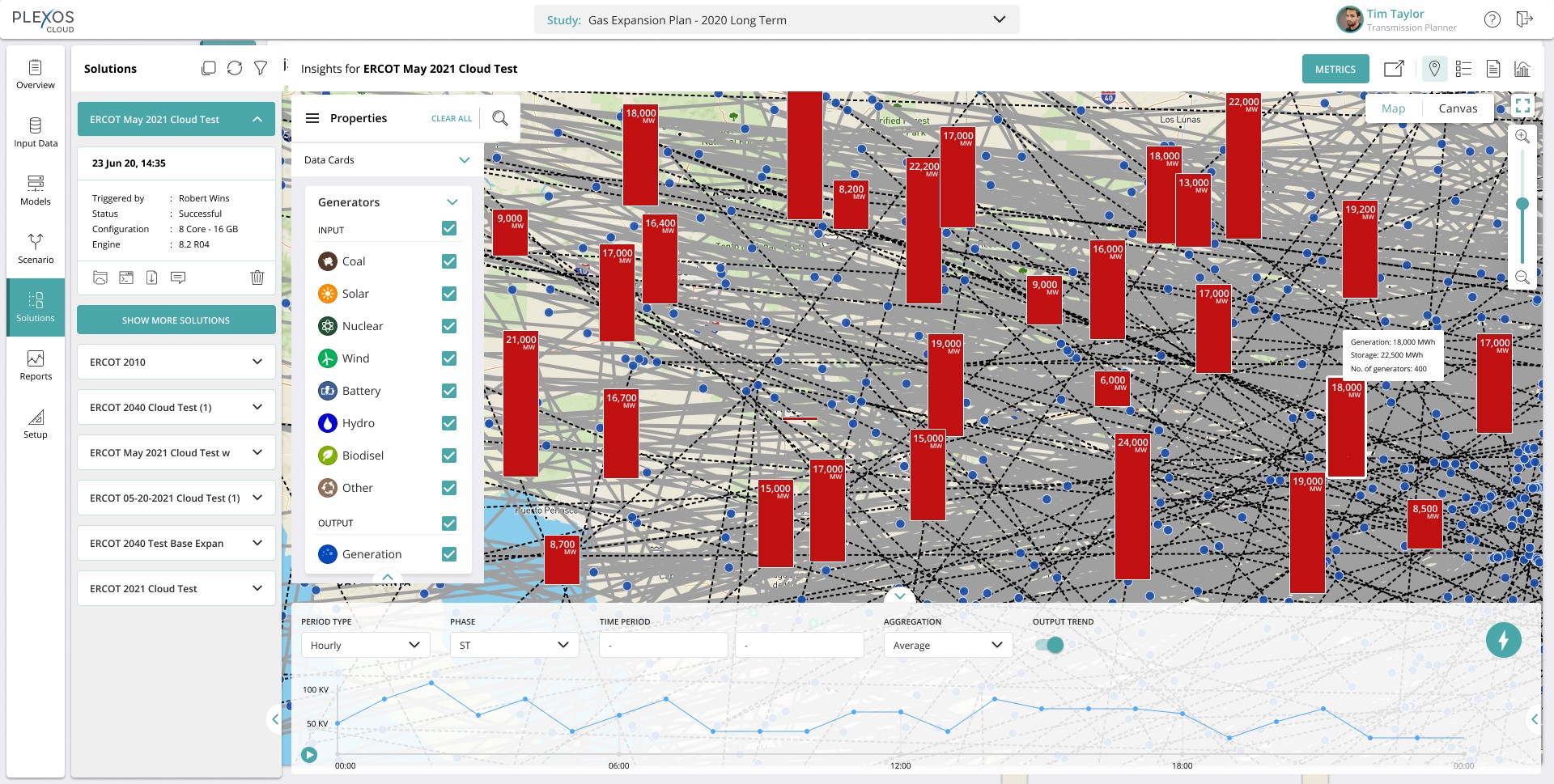
3. Super zoomed-in (85%) level
At this level, the whole information trickles down to individual generator level. The icons denoting the generator type appear on each bar whereas the secondary information such as the name of the generator, type, output value and storage appears on on-hover of the bar. Considering the bars would be relatively coded by the developers, a minimum height was still maintained in order to accommodate the generator icon information.

Testing & feedback
We tested the designs with eight internal analysts. According to them, there was a considerable improvement in getting accurate data in less time, it was easy to compare across locations at a quick glance without causing any cognitive load.
However, there were some new problems which stemmed out from the testing which the users felt should be addressed. Some enhancements needed to be layered upon this solution to make this foolproof.
It wasn’t over yet...
Resolve the lag while zooming into the map
Idea to denote overlap
View accurate detail of generators overlapping due to same geo-location
Keeping the experience consistent for individual and overlapping generators
Show renewable & non-renewable sources
A click-through to indepth generator deatails panel
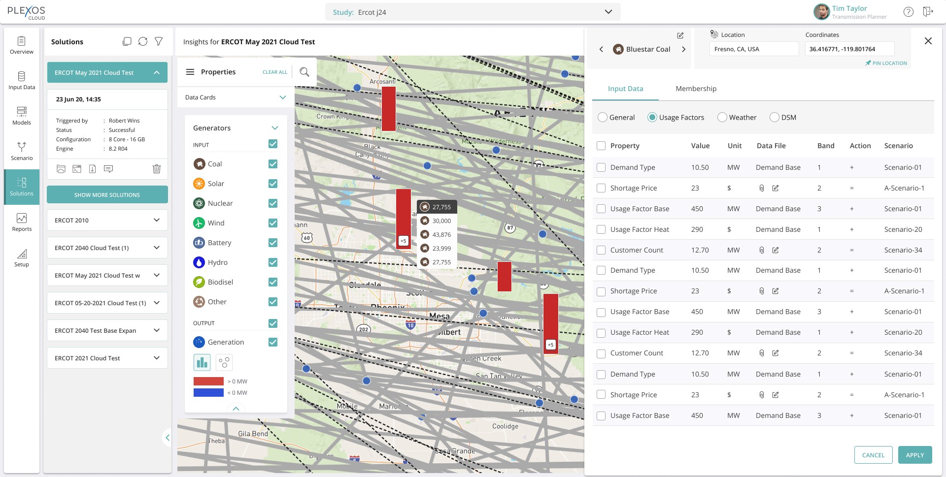
New problems, new solutions!
Re-defining the problem statement
Generation output bars for different generators present at the same exact coordinates were being hidden behind one another due to which analysts were not able to access the generators behind the first one. It is a usability issue.
Options
Zoom- out
Mid-level zoom in
Zoom-in
Tech constraints
1
80,000
80,000
No. of generators: 400
Renewable: 200
Non- renewable: 200
Storage: 22,500 MWh
Generation: 18,000 MWh
18,000
No. of generators: 400
Renewable: 200
Non- renewable: 200
Storage: 22,500 MWh
Generation: 18,000 MWh
No. of generators: 400
Renewable: 200
Non- renewable: 200
Storage: 22,500 MWh
Generation: 18,000 MWh
+8
On-Hover
18,000
Bluestar Ridge Hydro Plant
Region Name
Generator Type: Hydro (Renewable)
Generation: 12,000 MWh
On-Click
18,000
Low on tech feasibility due to the new “pill”form
2
80,000
80,000
On Hover
No. of generators: 400
Renewable: 200
Non- renewable: 200
Storage: 22,500 MWh
Generation: 18,000 MWh
18,000
No. of generators: 400
Renewable: 200
Non- renewable: 200
Storage: 22,500 MWh
Generation: 18,000 MWh
On-Hover
+8
27,755
30,000
43,876
23,999
27,755
30,000
43,876
23,999
Bluestar Ridge Hydro Plant
Region Name
Generator Type: Hydro (Renewable)
Generation: 12,000 MWh
Bars not visible
in background
3
80,000
80,000
On Hover
No. of generators: 400
Renewable: 200
Non- renewable: 200
Storage: 22,500 MWh
Generation: 18,000 MWh
18,000
No. of generators: 400
Renewable: 200
Non- renewable: 200
Storage: 22,500 MWh
Generation: 18,000 MWh
Bluestar Ridge Hydro Plant
Region Name
Generator Type: Hydro
Generation: 12,000 MWh
Storage: 30,000 MWh
+8
Too many clicks to navigate to the next generator (if the number is large)
G
+5
G
+5
15
27,755
30,000
43,876
23,999
27,755
Bluestar Ridge Hydro Plant
Lackawana County
Before
After
1.
2.
Two explorations on how to show accumalation of generators.
Common Icon representing either generators/overlap/multiple. Problems with this was that it was hard to find an icon that represents all generators
3 random generators overlapping to show multiple gens.
Tag suggests renewable, but would need a legend.
Things to think -
Placement of legend?
Discussion of how important it is to show this?
Wouldn’t analyst know whether the source is renewable or not from the type
Dev concerns
There is no input field for R/NR yet. They say it may not be possible
Zoom out
Mid level zoom in
On click when zoomed in
80,000
80,000
No. of generators: 400
Renewable: 200
Non- renewable: 200
Storage: 22,500 MWh
Generation: 18,000 MWh
18,000
No. of generators: 400
Renewable: 200
Non- renewable: 200
Storage: 22,500 MWh
Generation: 18,000 MWh
27,755
30,000
43,876
23,999
Bluestar Ridge Hydro Plant
Region Name
Generator Type: Hydro (Renewable)
Generation: 12,000 MWh
Indication styles denoting an overlap
The idea was to give an affordance which will hint the user to click on it. I explored various notification style buttons and indicators along with three circles overlapping to convey about the multiple generators. At the time, showing the symbol of “tilde” also popped up.
Mid level zoom in
G
+5
+5
17000
+5
17000
+5
45,000
+5
+5
+5
+5
+5
15
~
UX-UI that works hard, so analysts can relax
I finally went ahead with the button style option on the bars to denote an overlap since that totally won brownie points in affordance. There was a lot of back and forth as the stakeholders had multiple opinions on this. The UI had to be legible with intuitive interactions which sets the user in a flow.
Zoom-out

Mid zoom-in - On click of “+5” button on the bar

Zoom-in - On on-hover of generation value showing the name of the generator along with its location

Right panel opens up on click of the generator value showing in-depth information regarding properties and scenarios
Self-reflection
Challenges
Not being intimately familiar with the workings of a simulation platform posed some challenges. I relied heavily on specifications from the project managers to understand the energy industry in the US. Only then I could bring my UX know-how to dictate the appropriate flows
Lessons
Keeping the communication and follow-ups in different timezones extended the feedback loop. This project was a good reminder of the importance of testing early and communicating clearly.
An energy market modeling & simulation software which provides energy solutions.

Initial concepts and brainstorm...
Improvements after design review and discussions..
Pills with count
Use of symbols to indicate there’s more
Use of icons, shapes, colors
G = Generator